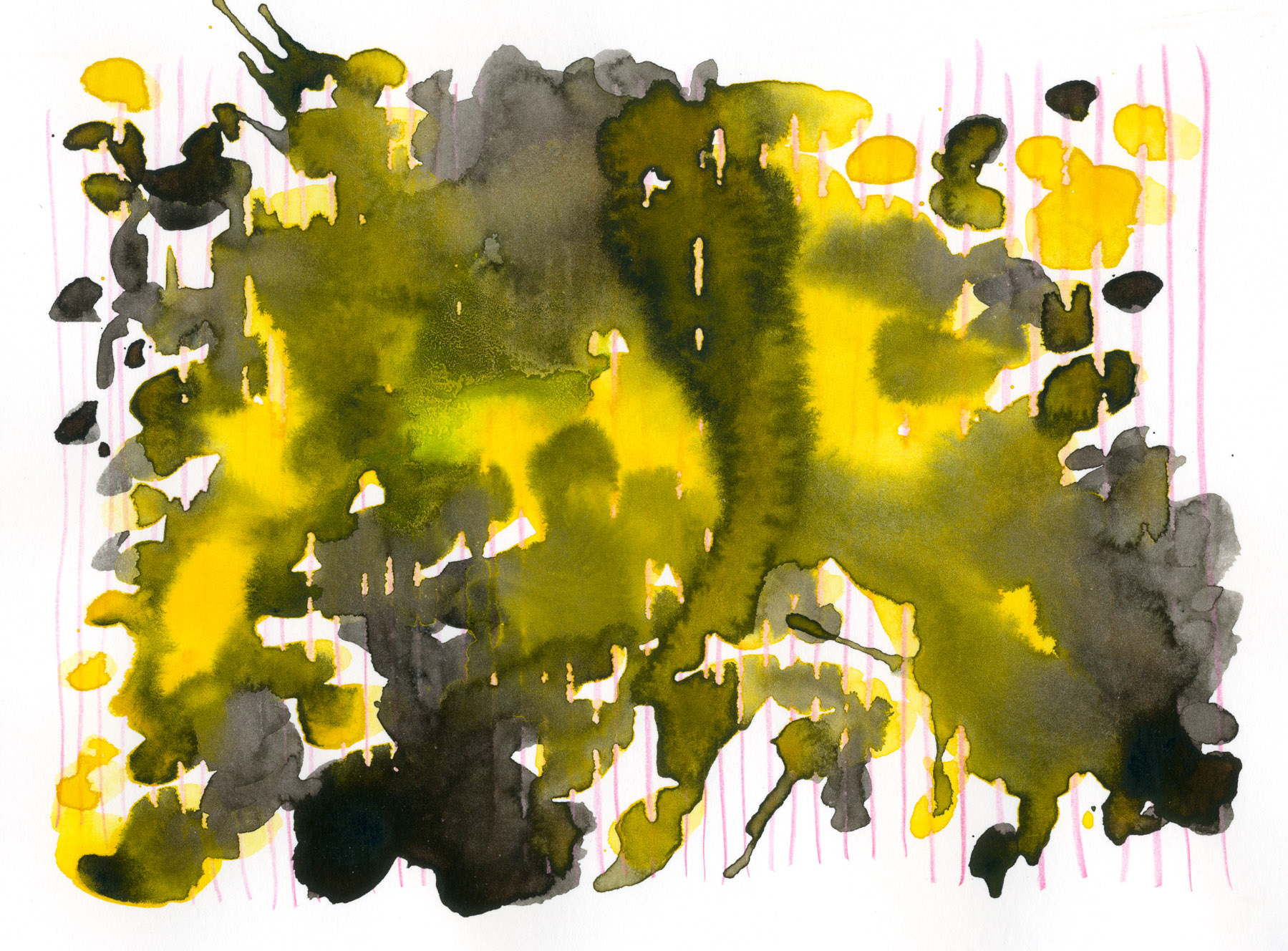
One year of D/A/P!
About a year ago I presented to my colleagues at our traditional weekly lunch series about why I am starting Design Art Practice. I reminded folks how it felt to be excited about school work and to be constantly learning - and then asked why that attitude of constant learning, and of making connections is much harder to keep up in the working world. And I proposed that the arts (and humanities) are the missing link.
It can be hard to justify experiments, but we should do them anyways.
As we professionalize, even in a creative career, time becomes a lot more valuable. And we stop experimenting just for the sake of it. There is no longer an academic structure that would support out experiments, encourage our original ideas for ideas’ sake, and help along the way. We are responsible for keeping ourselves inspired and moving, all against a constant pressure of making money or at lease being productive.
Art feels different. Studying it with a purpose fills the missing pieces for me and gives reasons to keep trying. Design Art Practice teases out the parallels between my day work and the human artistic things that make it meaningful - to share them with you.
After a year, I learned that I want to keep going.
What have I learned in a year? That I want to keep going. I also learned, from experience - and many long nights - that when I shoot for deep scientific pieces with correct MLA style citations, they take a lot of time to write, and usually come out tedious and too long. And that telling stories about trying stuff, and how it doesn’t always work out, from a personal perspective (like I am doing now!) is more relatable. Hey, several people even wrote me back! (Thank you.)
Top ten design art things!
This wouldn’t be a year in review style post, if I did't provide some sort of best-of or a summary. Here are my favorite ten things. I’ll probably go back to re-do the same experiments if I’m ever running out of ideas in 2017 :D
- My Analog Design Tools - the first post I wrote, and still a favorite. Who doesn’t enjoy obsessing over the tools in anticipation of producing perfect work?
- Learning to use what seems like failure to your advantage is a great life skill. But especially good for creative applications.
- Mark making can also feel like an “imperfect” application of tools like pens and pencils. Treating the exercise as a free exploration opens up unique interesting uses for the tools, And it often makes us more attentive to the defaults we accept, from our pens and from life in general.
- Following the art of Ellsworth Kelly, I looked for a simple principle (draw some lines, cut, rearrange) in other art applications. Often a simple repeatable “recipe” will give the most beautiful complex results.
- Similarly, we can borrow the idea of a series or multiple to communicate a complex idea - something that wouldn’t fit into a single icon or representation.
- When design ideas run dry, it helps to step away from the work set-up. (Let’s face it - it’s often a desk with a computer and a pile of paper nearby.) Making analog art helps us remember about the things we can see and feel, that are harder to get with “computer” thinking.
- One kind of analog art I keep going back to is watercolor. It’s super portable so I can travel with it - but it also lets me take advantage of all the weird little accidents that happen when paint hits real paper.
- My semi-obsessive study of color allowed me to be a speaker at several conferences - but more importantly, helped me justify a personal preference for IK blue as a brand color for this place, D/A/P. Color IS subjective, but with enough digging, a designer can build a strong case to support even her own color preference.
- …Have you ever bought original art? Have you ever felt that it is not for you, but for other, more informed and super rich people? I did too, until I got over that. You should definitely buy art – as an investment in your personal hustle.
- And, if you were to see one exhibition that would feel like home to a designer, anything coming from the Black Mountain College is a good bet. At least in the US, I believe there is a conspiracy to include Bauhaus concepts in everyone’s design education, to the point that they become self-evident. (and we wonder why midcentury modern furniture sells so well.)
That is it - ten things to summarize a year of exploration! You can probably also tell, by counting or what not, that I don;t have exactly 52 weekly posts to show for a year of effort. And that’s OK. I’ve had to balance this creative project with other exciting things, and sometimes they won. One big surprise was an opportunity to take on a management role in addition to being a UX designer, which I happily accepted. This opened me up to more business and strategy ideas than I can document all at once. And as I continue to experiment with these design / art articles, the exact formula of artwork -> art concept -> application to UX design might loosen up a bit.
One thing I always look forward to is learning what worked and what didn’t. So if you have ideas to share, or just a quick bit of feedback - please send it my way.
And thank you!
