Sketch your bookshelf
Since the beginning of this year, I’ve been making time to read books related to design. But the most convenient, and often the only, way that I’ll read during the week is from my phone.
I get through a lot of content quite efficiently on my commute, the reading I complete does not feel real enough. I don’t get to hold a book open, and feel the thickness of unread pages on the right make their way over to the left. I don’t get to look at a book cover as much as I would in print - it's only an icon on my iBooks shelf. What can I do to make my digital reading feel more real? Would making art about it help?
One day I remembered that an artist had already solved this problem of making a set of books feel more personal. In My Ideal Bookshelf, famous artists’ imaginary sets of books looked real, and so relatable in bright happy-colored illustrations. I decided to follow a similar style to bring my own books out of the phone.
Book cover via idealbookshelf.com
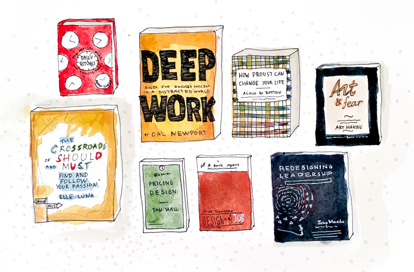
Inspired by the informal illustration style, I sketched the covers of the digital books I’ve read so far this year in watercolor and ink. The lines are a bit shaky, but capture the casual look I was going for.
Now, I am ready to tape this to the wall above my desk. Maybe even frame it! A simple handmade piece like this sketch can help remind me of the ideas I learned in the books. The unapologetically hand-drawn style makes the experience much more real. Actually, the illustration style does not matter. If you’re more comfortable doing pencil sketches, a collage, hand lettering, or even a sculpture - do that! The point is to give yourself a reminder. I expect mine to help me remember a useful idea on more than one occasion in the future. Stay in touch - and I’ll report on my findings!

