Kandinsky & three kinds of Inner Necessity
In my design practice, I constantly seek out timeless principles to justify the sometimes intuitive decisions I make about shape, color, composition, and the appropriateness of a design solution to a human problem. Wassily Kandinsky’s work provides a human-centered approach to abstract art that designers can use today.
Wassily Kandinsky, Untitled, 1921
Kandinsky’s Philosophy
Wassily Kandinsky (1866–1944) was an artist born in Russia, who worked in Germany and France most of his life. His work and visual style remains a strong influence on contemporary art, but he also formulated the first theoretical basis for nonfigurative art. In Concerning the Spiritual in Art, Kandinsky describes two key principles. One with mainly philosophical implications, and one that concerns aesthetic.
The philosophy behind art provides a context in which he works. He observes a shift (or an oscillation back and fourth) between the materialistic in art and the non-materialistic, soulful content in art. In the 1910s Russia was on the brink of revolution, and Europe was about to enter World War I. He equates current political events (movement for equality and the people’s rights) with a general necessity for art to move away from the materialistic (bourgeois) and consumerist, and toward the more abstract, inward and spiritual.
Stemming from this non-materialist approach, Kandinsky also provides a philosophical basis (the first ever) for nonrepresentational art. Using the concept of inner necessity, he explains the inner workings of an abstract painting, and the relationships within it that make it make sense. The “inner necessity” is in fact a fine tuned use of artistic means to enact an effect on a human soul. Just like music (which is nonrepresentational of actual sounds of nature, but instead abstract) Kandinsky states that abstract art should not have the burden of explaining itself through mimicry of the real world (like representational art does) but can stand on its own merit. AT the same time, Kandinsky does not negate the value of representation. He says that if we were to remove it from our arsenal of artistic tools, we would be losing an important part of our expressive voice.
Human centered… abstract art?
According to Kandinsky, a beautifully arranged composition is not enough in itself. It must also have an effect on a person, and that effect is what justifies its existence and makes it good. This approach sounds remarkably similar to how user centered design, and design in general, must not only be beautiful, but becomes beautiful and good only when it answers a specific human need.
Kandinsky - Der Blaue Reiter [The Blue Rider] (1903)
Academic approach during revolutionary times
Kandinsky started his art career relatively late (after he turned 30 and finished a law degree). He used the scientific, reasoned and methodical approach of his previous studies to art theory writing. In contrast, many of his contemporaries were artists who took a radical and revolutionary approach to explaining the new in art. While he noticed trends and explained where they came from and where they were going, he did not (unlike other contemporary artists) propose to completely get rid of all previous art in a revolutionary manner, in order to make room for the brave new art.
Inner necessity principles - what should art express?
Kandinsky explains three levels on which art can communicate. (paraphrased from The Spiritual In Art)
- Each artist expresses their individual voice
- An artist speaks for their times and the environment that produced them. Any artist trying to blindly copy a language or style of the past without reinterpreting it to be contemporary would produce “dead” art that does not speak to the contemporary audience.
- An artist as an artist - gives their audience that timeless value which art is capable of giving. That value is independent of time or place.
Inner necessity principles - how should we express it?
Kandinsky also breaks down the basic elements of abstract art - shape, color, and composition. Like musical notes, each of them has their own effect, but the effect will combine or cancel out when color and shape are used together.
The effect of an individual color: red face vs. red dress
Kandinsky explains that the effect of a color changes based on whether or not its intrinsic effect (the attention-grabbing warmth of red) is used in conjunction with a representational subject. So, a red color of a sky or a face would by association impact a specific mood, and that effect would be difficult to override because the human association is so strong. A red dress, on the other hand, would not have the same associative meaning because a dress by definition has no intrinsic “natural” color - it can be any arbitrary color.
Color and shape
Kandinsky pairs shapes with specific colors for maximum effect. And while the “natural” color strengthens the effect of a chosen shape, a different color can be chosen to soften or oppose the effect of a shape.
Deep blue and blue-green have the effect of drawing the viewer inward. The most natural shape for this effect is a circle.
Yellow is a powerful, warm color and has the effect of radiating outward, which is most prominent in a sharp triangle shape. When used at high concentration, the power of yellow can make the viewer agitated.
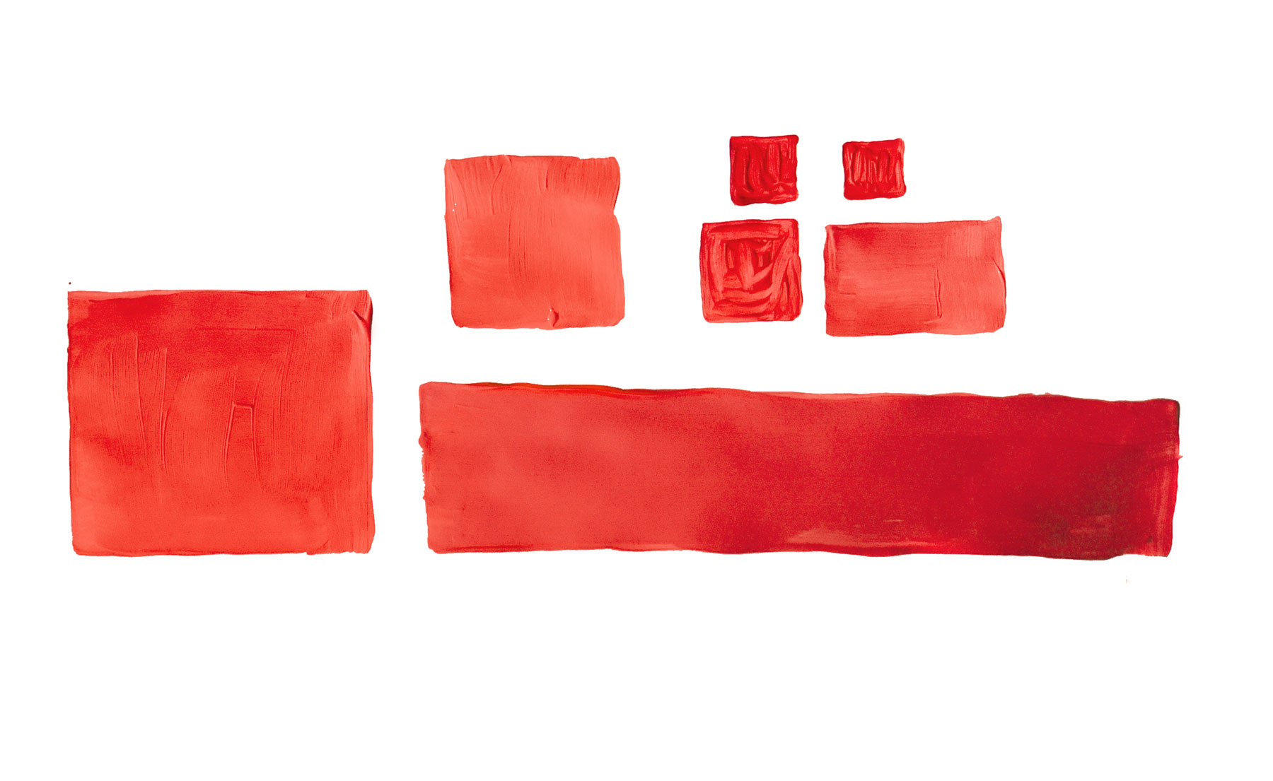
Red is an active, warm color. It can take on the inward pull of blue, if a cooler, purplish red is used - or the outward radiating tendency of yellow in a warmer, orange-red. A rectangle is a natural shape to accommodate red color.
Kandinsky equates shape-color combinations with musical notes. Compositions of multiple shapes and colors, just like music, follow melody.
A Kandinsky approach to Design
As designers, we can look at our work using three levels of Kandinsky’s Inner Necessity principle:
- Are the elements (colors, shapes) individually harmonious? Do express their inner nature in the best way possible? (Essentially, are we painting our triangles yellow? And if not, is there a good reason not to?)
- Do the elements come together in a harmonious composition? Do the individual elements to relate to one another in the way we intended? What can we adjust to bring them into balance?
- Does the composition, and the piece as a whole, serve the greater intention of the work? Does the composition need to be intentionally put out of balance to communicate with the viewer?
In design, we usually plan from the outside in (audience, then composition, then details) but can flip this order to evaluate work-in-progress. Next time when you’re stuck on a design project, make sure you’re addressing the problem on all three levels, and you’ll likely find a way out.

![Kandinsky - Der Blaue Reiter [The Blue Rider] (1903)](https://images.squarespace-cdn.com/content/v1/5596ec2fe4b06639d23f403c/1450900954576-93KNRPS007FONR1XU2Z7/image-asset.jpeg)


