Series and Multiples
If you’re struggling to communicate a large concept in design, consider using a series of compositions as the solution. Series and multiples can help to communicate larger ideas, to include specificity, and to show progression. A series represents a sum of the parts like a single object or manifestation of an idea never could.
Series in Modern Art
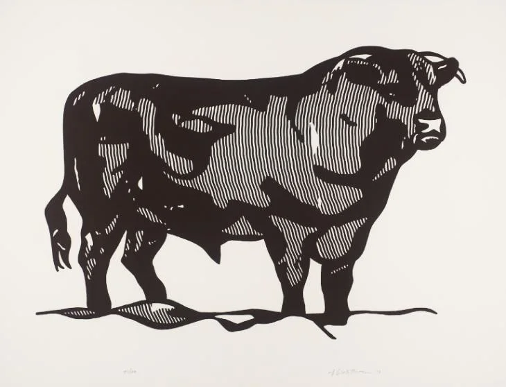
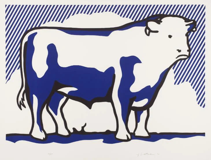
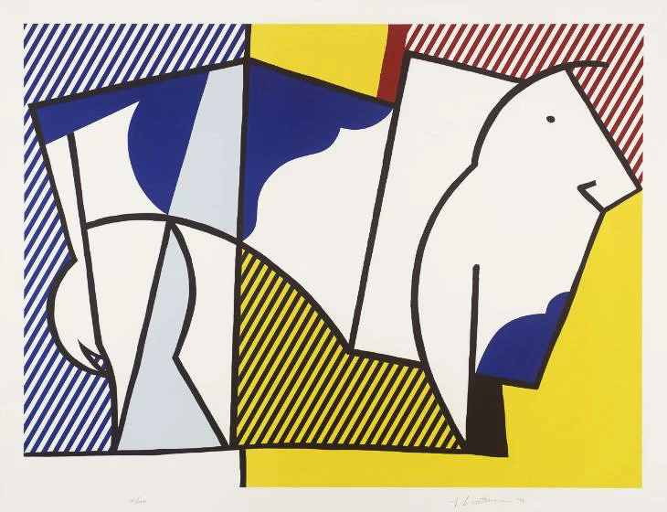
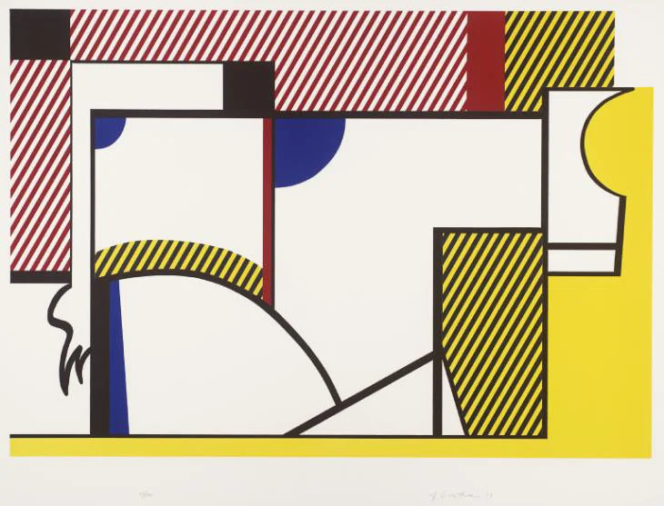
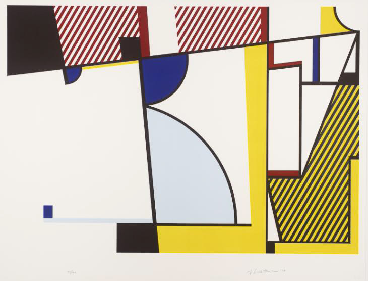
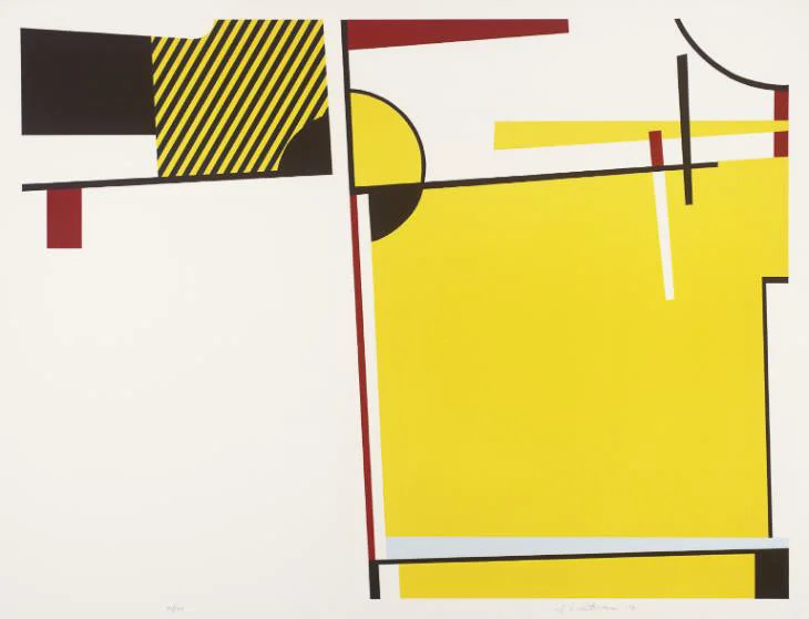
Roy Lichtenstein used the series as a tool to distill an abstracted form from a realistic one. Before him, Theo Van Doesburg and Picasso had also done similar exercises to abstract the essential shape of an animal.
“Such precedents illustrate the modernist belief that universal truths could be revealed through distillation and abstraction” — Serial Impulse exhibition
Lichtenstein images via Tate Modern
Series can bring out the similarities
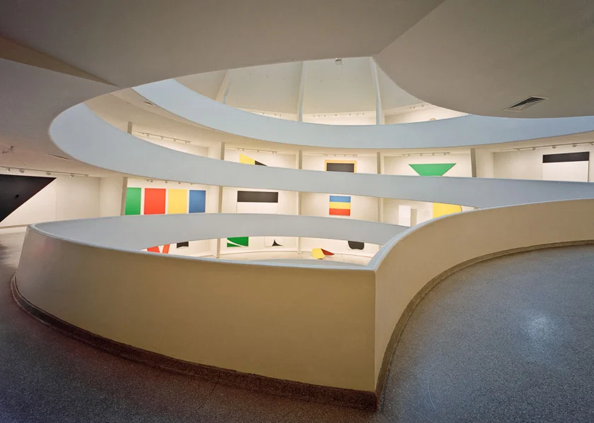
While series are great at representing a continuous, developing process, they can also represent something that’s changing, in contrast with something that is not. For example, any single piece from the Painted Wall Sculptures (1982) series by Ellsworth Kelly, viewed alone, speaks on a different subject than the series together.
Alone, the monochrome trapezoid shaped canvas in blue can be about blue, or about trapezoids, or about sharp angles.
Together, or even each individual piece in the context of a series, speaks about the thing that unites them together: the marvelous effect of a flat (matte and monochrome) surface floating above the wall. The canvases vibrate because they have the look of both a 2D and a 3D object, and it is by looking at them together or in context that we can truly appreciate the effect.
Ellsworth Kelley image via The Guggenheim
Series can show change over time
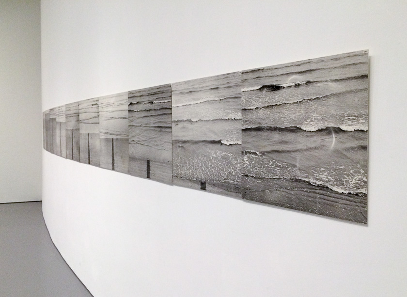
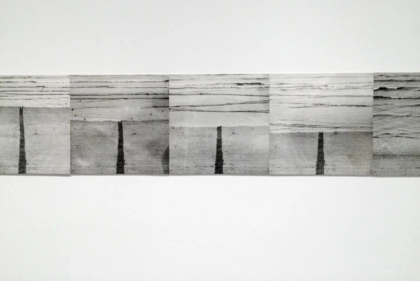
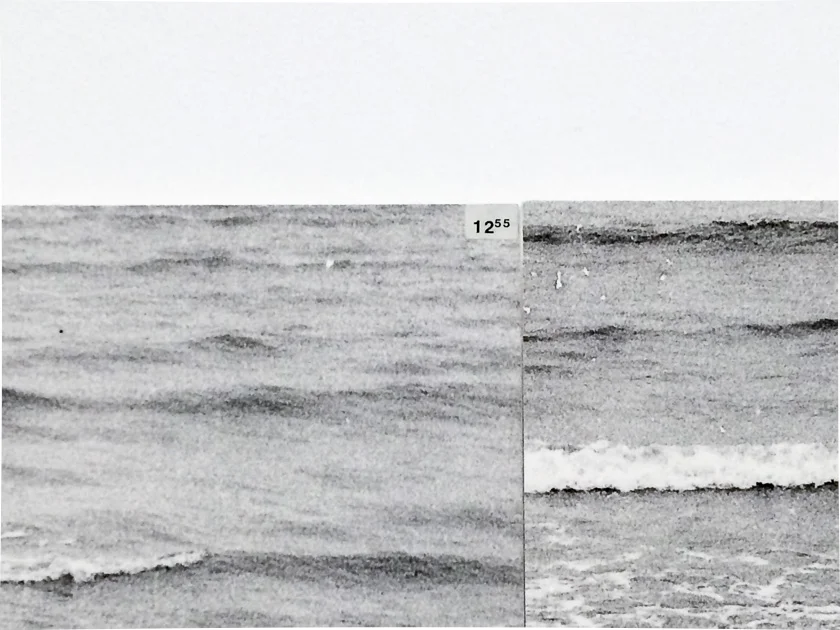
Jan Dibbets: Tide (1969)
We are so used to photography it has become self-evident that photographs show specific moments in time, and as a series, they can show something changing over time. When used in a different medium, the effect can feel cinematic (for example, when consecutive frames in a flip book begin to feel like motion).
A series can be about seriality
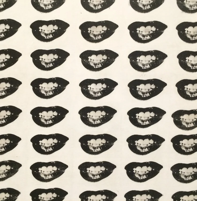
Jackson Pollock’s work speaks about mass production and the repetition and amplification of images. We see something repeated endlessly in the media, and examine its celebrity. But for me, it is the slight difference between the impressions that makes Pollock’s work truly interesting. While the screen prints could have been much “cleaner”, they seem intentionally slightly imperfect to give each one character.
A series can be about media and language
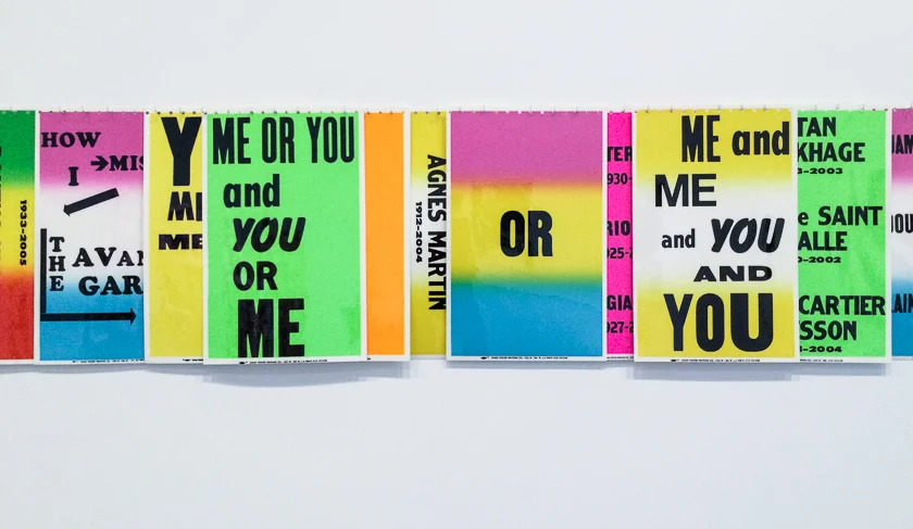
Allen Ruppertsberg: As The Crow Flies / How I Miss the Avant-Garde (2008)
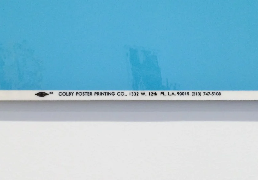
Allen Ruppertsberg reflects on the changing nature of what is considered to be the avant-garde at different times. A series of commercially printed and laminated posters here allows to use a minimally decorative and consistent format to communicate more detailed information on how disjointed and non-linear the history of avant-garde feels. He used what seems to be a deliberately mass produced, commercial look (even leaving in the printer’s mark at the bottom of each poster) to tie together the series.
Series & multiples in branding
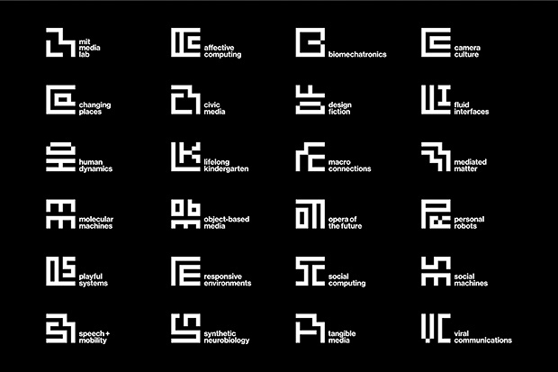
MIT Media Lab logo via Pentagram
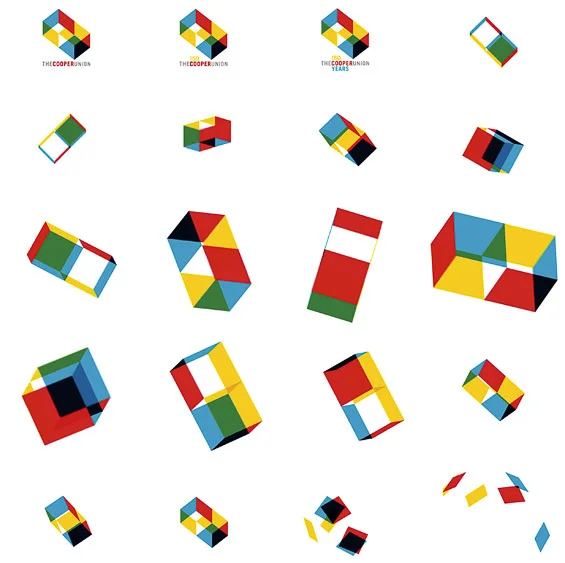
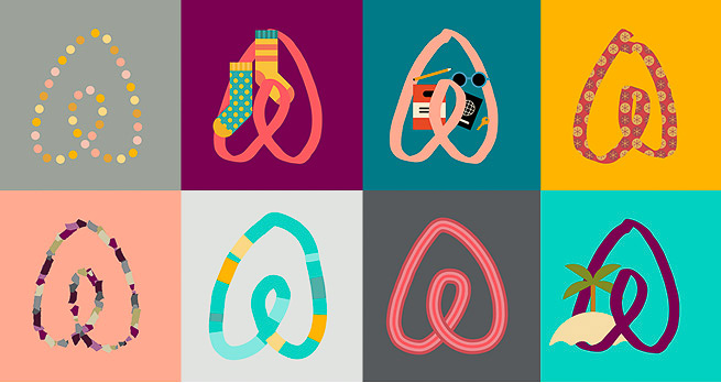
The concept of serially, or flexibility in branding, has been popular with brands in the past few years: from the 2014 redesign of the AirBnB logo (which allows the public to create their own version) to the modular identity of the Cooper Union and the MIT Media Lab.
What unites these design solutions is that each one relies on a set of rules for how an on-brand mark can be produced, while allowing for variation within this system.
Flexible graphic identities are just one way to use the concept of a series or a multiple to solve a design problem. Posters that follow a consistent layout, or even the idea of a layout grid itself all seem related: they explore variation within specified rules, and add meaning through that variation.
What series can do in design
Flexibility & practicality Just like stamps, serial objects become collectible: each one keeps ties to the complete concept, but at the same time it is a unique interpretation. Series allow us to have one, several, or many. The same general idea, e.g. a concert, can be communicated through one or many posters, on different scale, without losing its meaning. Because of this, seriess can become very practical for users.
A single theme Because we are familiar with the concept of a series, it can become an efficient vehicle to communicate a complex theme through a series of different objects. Even very disjointed things can become united when properly explained. Subscription services like Birchbox have used this idea to curate a set of things unified under one theme.
Address wider audiences When a concept is communicated through a series of images, rather than through one, each image can be more unique, and can therefore speak more directly to a specific audience. UX designers have shifted away from asking opinions of focus groups (whose consensus truly represents the opinion of no one) - to interviewing individual people and asking about their unique user story. A unified series of unique manifestations of a design concept can serve a similar purpose.
Series can help tackle big ideas
Because of all the things that series and multiples do well, they are especially suited for tackling big ideas. When it seems impossible to solve a problem by providing one thing – when a solution feels too static – try instead approaching it as a series. Constraints and a strong set of rules can keep the results within a very clear system ( like Kelly’s minimalist paintings) - and the sum of the parts will help communicate large ideas with efficient means.
