Matisse, Minimalism, and repetition
Minimalism is enjoying a comeback these days, it seems to be everywhere from iOS7 to Material Design to Zara and H&M. But too often, we aim to replicate the style of minimalism without its substance. See how Matisse arrived at powerfully minimal gestures through repeat practice.
“I have always considered drawing not as an exercise of particular dexterity… but as a means deliberately simplified so as to give simplicity and spontaneity to the expression, which should speak without clumsiness, directly to the mind of the spectator.”
My kid could do that!
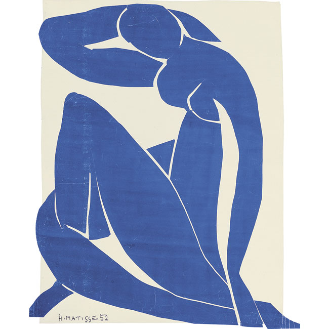
Matisse’s work can seem too simple at first. His Blue Nudes, or the Themes and Variations drawings seems quite easy to copy: just a few lines or a few pieces of paper! The paper cut-outs in particular often become a subject for school or kindergarten art classes.
But while the economical gesture itself is easy to repeat, it is the process of distilling the gestures to represent a more complex subject that gives minimalism its substance.
Repetition
To arrive at the cut paper collages, or the contour drawings, Matisse went through tens or even hundreds of variations. Sometimes these were light charcoal sketches, partially erased between attempts. Other times - many similar studies of the same subject. Or consider the paper collages: the perfect movable medium. If you search for images of the Blue Nude, for example - you’ll immediately see several slight variations in museum collections. There must have been many more that were not finished (fixed to the background paper) or did not survive.
It is through careful, methodical study that we can arrive at a concise gesture that captures the essence of a subject. Only through refinement we can reliably capture more with less. Even in cases when the first, casual gesture drawing becomes the best one, the skill to make that drawing happen (seemingly by magic) comes from practice and careful observation.
Minimalism is medium-specific
Part of the process of arriving at minimalism is learning to use the medium to its fullest potential. The building blocks are different, and we must learn their character to use them with elegance and purpose.
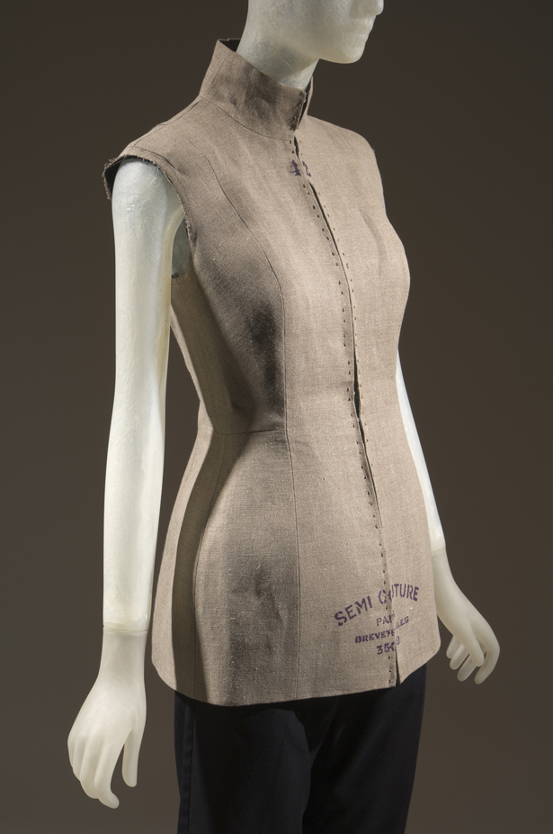
For example, fast fashion tee-shirts in crisp white with the word “minimalism” printed on them seem to me very far from an elegant and economic expression of dress-making. I imagine conceptual minimalism in clothing as a fresh way to fold fabric instead of stitching to create a lapel - or even this garment from Maison Martin Margiela, that draws from the tools and materials you need to make a dress. It creates the illusion that nothing at all was added to the dress form, and the fabric covering the mannequin itself served as the garment.
Image via The Museum at FIT - Martin Margiela, sleeveless jacket, beige linen, spring 1997, France
Is the modern web minimal?
I believe it is, or it can be. With Material Design using flat color and seemingly “natural” web things, and with iOS7 and later adding continued refinement to an unapologetically flattened digital space, I see examples of aesthetically minimal design that I like. They are considered and take advantage of what the medium allows. With more dynamic, “smart” things possible in the browser, we can build smarter and more elegant interactive things.
The minimal aesthetic also affords the opportunity for aesthetic inclusion of modern art. It’s been pointed out that Matisse and Picasso inspired many parts of the Apple interface and branding. And art living unapologetically inside design makes me happy.
How to practice minimalism
Here is an intentionally simple, and readily available exercise to practice teasing out minimalism.
Draw the same thing over and over again. Organic things are best: they will offer more nuance of line, and at the same time challenge us to generalize the form to give it meaning.
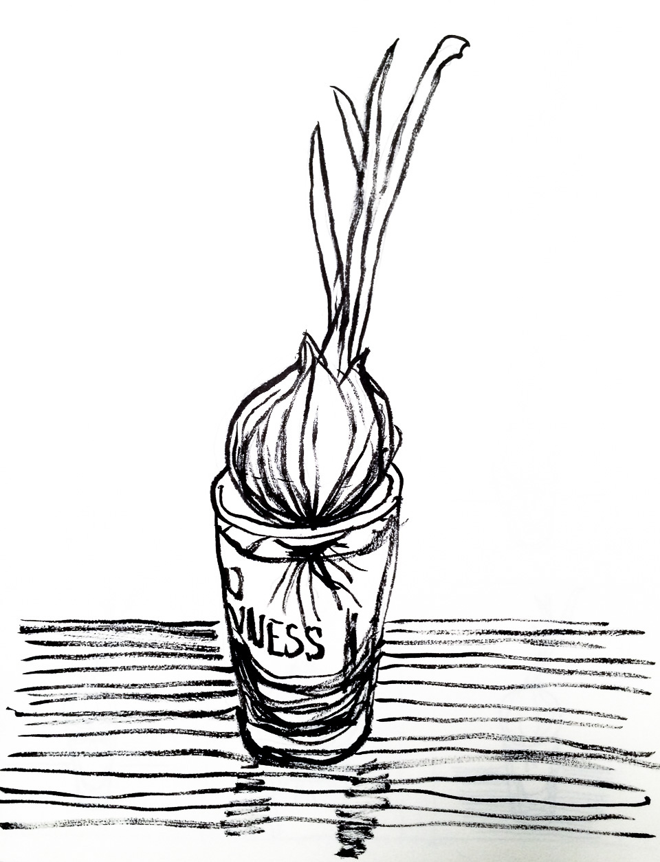
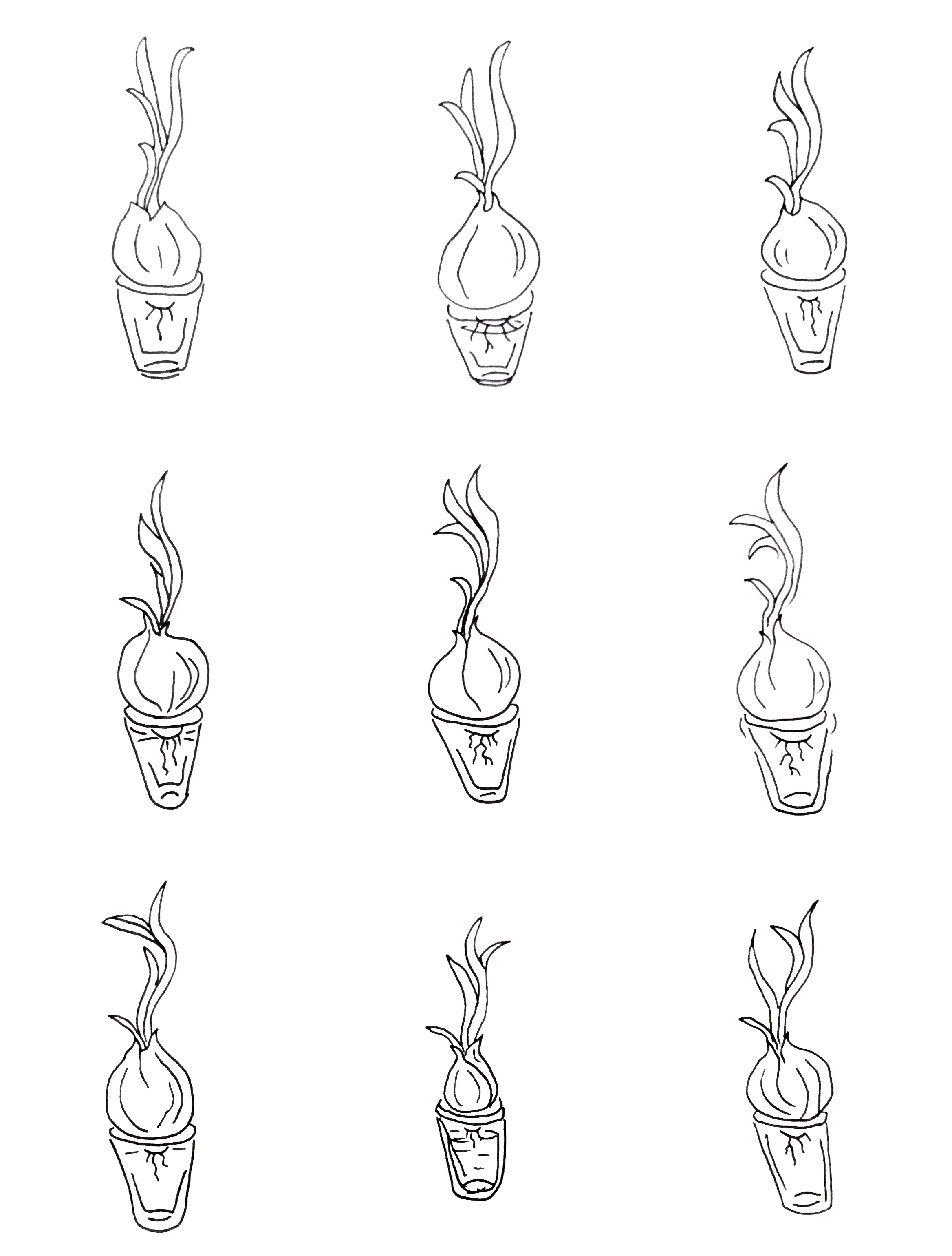
I chose a sprouting onion in a beer glass as my subject. It’s fresh and green, but season-less. You can grow one in a week even in the middle of winter.
I first drew the onion in all its detail, just to get it out of my system. This seems like a good starting point.
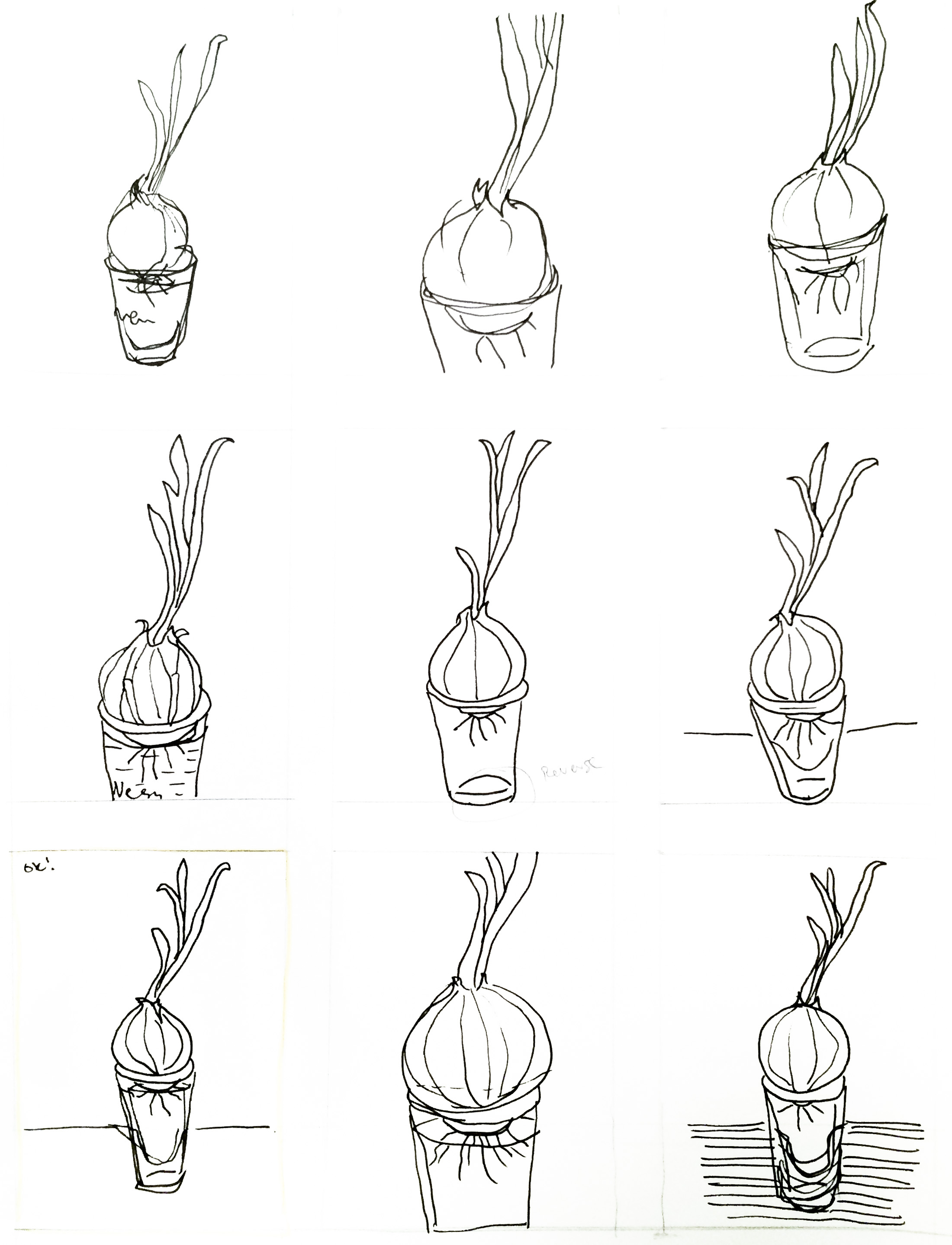
Then, I drew nine variations from reference. These helped me study the shape. I kept looking at my subject more than I did at the paper, leaving the drawings intentionally messy.
With the first nine completed, I felt I was familiar enough with the subject, and concentrated on line and form in the next batch of drawings. I glanced back at one from the first batch that felt the most successful, so my own simplified drawing became my reference.
My last drawing was not the one I felt was most successful - but the practice or making the many versions allowed me to see and decide. I also felt quite comfortable with the gestural, wonky lines and did not bother making corrections.
Did I arrive at a perfectly minimal drawing of an onion with a 0.8mm Micron pen? Probably not. There’s no way to tell. But I know that through repeated study, I distilled and refined my “onion in a glass” gesture, and made progress toward understanding what minimalism might entail.
Minimal design inspiration
What to do if there’s no time to practice eighteen variations?
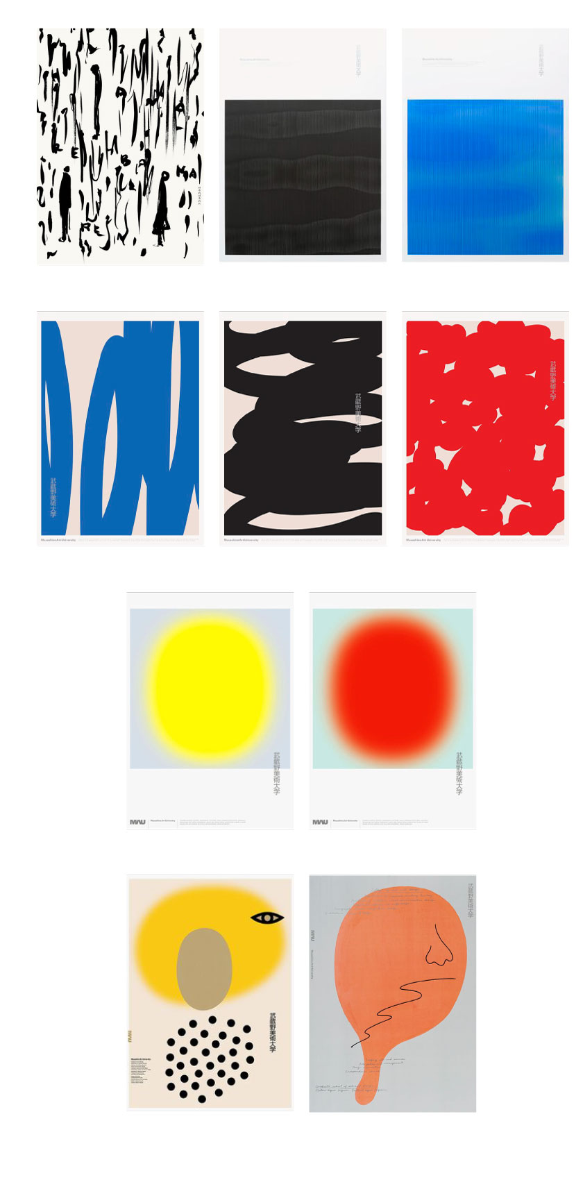
When I look for minimalism inspiration, Japanese design is often the best source. It works for me because it’s rooted in a tradition of careful consideration of all the elements (think flower arrangements), and sufficiently fresh and unfamiliar because I don’t see it every day on the street. Just looking at posters or packaging, I see how the spacing and margins are nuanced and the forms seem organic and often subtly complex.
